Showing posts with label Colour Inspirations. Show all posts

Tuesday, August 10, 2010

You know how I love a good challenge!

My life seems to always be about challenges these days.

1. Challenges with my weight and my love of food and wine
2. Challenges with my family, being tested hourly by that of a 2 1/2 year old son
3. Challenges with my marriage, it's hard when your better half is working in a different city
4. Challenges with my business and finding the right work life balance

I am happy to report however that I have made significant progress in many of these areas.

1. I started back at Weight Watchers last week and after 1 full week on the program I have already lost 8lbs!
2. A new found strength from within (due largely to the fact that I have decided to step up all aspects of my life) have me less frustrated, and calmer when he isn't. Not sure it's having an effect on him yet, but my throat is happier with less yelling!
3. Looks like this is the last trip to Winnipeg Ed has to take! But I am still keeping my fingers crossed, you never know! Plus we have booked a trip to the East Coast to visit a wonderful secluded Island in the Bay of Fundy called Grand Manan. I can't wait to sit on a cliff watching the ocean roll by!
4. My business in the new area is picking up. Everyday I am meeting new people, and making new contacts. I have also scheduled work nights so that I can stay ahead of the tasks and spend less time crunching at the last minute before a class, event etc.

So today, I have a sense of accomplishment. Things are moving forward. And life is pretty good!

Shelli Gardner the CEO and founder of Stampin' Up! posts monthly challenges on her blog, open to both Demo's and customers alike. I haven't participated in a while. Thought I would give this month's challenge a go. It's all about using the Colour Coach to find new and innovative colour combos. And stepping out of your comfort zone.

I have had an idea to use the Elements of style flowers on Marina Mist for a few weeks now. It sort of has a Wedgwood thing about it. But I knew it need to be grounded by another colour. So I pulled out the Colour Coach and tried out a bunch of different colours. Well, it so happens that my fav new colour, Cherry Cobbler was the winner.

And since I got my Holiday Mini sneak peak items today, I thought I would just have to play with the new Cherry Cobbler Seam binding ribbon! Yum! It has a wonderful sheen to it, and it is light and airy. Just lovely. Sorry my bow looks like junk! My eyes are heavy with lack of sleep. The sentiment was framed by a layering of punches. The Designer Label, 1" circle ad the small oval punch bring it all together.

Anyhow, it's very much time for me to go to sleep. I can barely look at the computer screen.

Don't have a Colour Coach yet? Visit my online store to order one today!


Cheers,

Friday, August 6, 2010

Sorry I have been so quiet, and PPA!

My family has abandoned me this week (husband in Winnipeg, son at Grandma's, daughter at camp) and I have been extremely busy getting ready for my Martini Party tonight. So sorry for the lack of posts.

I made a card to send to my daughter at camp. This is actually her stamp set. It arrived the day after she left. She earned it for helping me organize my stamp sets. She did a ton of work stamping them into my binder, sorting them into categories and then punching out little colour dots (based on categories) and adhere those to the sets. Then she put them in my cabinets so that they can be easily found. It was a TON of work and I would never have got it done without her. So since she wanted this set so badly, she asked me to make her a card with it.

As it turns out, this card would work well for a boy too. And so it works well with this weeks PPA challenge- KISS Masculine. Not sure this card is really a KISS card, but it didn't take me long at all. I simply stamped the little monsters with Pear Pizzaz, Concord Crush & Pumpkin pie, highlighted them with my blender pens and ink from my ink pads and voila!

I hope she likes it!!

Cheers,

Friday, July 23, 2010

PPA 52 a sketch challenge

I generally prefer colour and inspiration challenges to sketch ones, because they allow for more freedom. But I have to say that I love the composition of this sketch for the PPA 52 challenge. And as I looked at it to decide what to do instantly one of the cards I designed for this months Card class came to mind. So I thought I would use that as my starting point. And this is what I came up with.

Once again I am using the Daffodil Delight DSP and the Tempting turquoise too. On the last card, I used the stripes, for this card I just flipped it over for these very cool elements from the Artistic Etchings set. I adore this print. The Congrats is from the awesome Perfect punches stamp set.

I decided to make this a congrats card because my awesome Upline Caroline LeBel placed #6 for Demonstrator of the Year for the 2009-2010 Stampin' Up! year and #1 for Senior Associate Promotions in her downline!! Way to go Caroline!!! I am soooooo proud of you. You truly are an inspiration. Caroline has had a very difficult year personally yet she still remained within the top 10 for all of Canada amongst some very determined women. It is quite and achievement. So, I am going to be sending this to her along with a little something else I am working on! Keep your eyes on your mail over the next few weeks Caroline!

Don't forget to go back to this post, and this post and leave comments to be entered to win a fun prize pack. You must leave a comment every day for the 5 July Card Class cards to be entered to win.

Cheers,

Wednesday, July 21, 2010

PPA Artists pick!!

Wow! I got a lovely surprise this morning. When I get up, one of the first things I ALWAYS do is check my email on my iPhone (not sure I could live with out it!). And this morning I was greated with a wonderful surprise! I was chosen as one of this weeks PPA Artists Picks!

Click here to view their post!! :)

Thanks Ladies! You made my day! I only wish I had taken a better pic of my card!! I don't know why the light was not participating that day!


Oh how I wish that I was in Salt Lake City, Utah for the annual Stampin' Up! Convention. Perhaps next year!

Cheers,


Thursday, July 15, 2010

Wedding PPA challenge

This weeks PPA theme challenge was well timed, because I had to make a Wedding card for my son's nanny who is getting married later this month. I can't wait for the wedding because my son is her ring bearer and my daughter will be walking him down the aisle as a junior bridesmaid. I will definitely share pictures after the wedding. I decided to use my wedding colours for this card, and she is using red & white anyhow, so it fit. My wedding colours were burgundy (or rather a deep red), black and cream. Stampin' Up!'s Bravo Burgundy is a bit to brown a Burgundy but thankfully we have the BEAUTIFUL new Cherry Cobbler! I am going to be using this colour a lot!

This card took me a while. I started out with one vision, that wasn't working for me, switched almost completely and then came up with this design. I don't actually have any wedding images (perhaps I should be putting some on my wish list....) but I have seen a ton of cards made with the adorable Bride and Groom hearts. And they were really easy to make. The really cool thing about this card however is that the ribbon closes the card! You have to untie it to open it! Fun huh?? I will list the instructions for this card below:

1. Fold a piece of Cherry Cobbler card stock in half to form card base.
2. Decorate the background using the Baroque Border wheel and Basic Black ink. I used a Wheel Guide to ensure that my lines were straight.
3. Take a 2 1/4 x 3" piece of Cherry Cobler and punch out the corners with a Ticket Corner punch. Mount this to the top half of your card base using Dimensionals.
4. Punch out 2 large hearts in with Whisper White card stock and 1 heart in Basic Black.
5. Stamp the florish design heart from the I {Heart} Hearts set on one of the white hearts in Versamark ink. Sprinkle with Iridescent Ice Embossing powder and heat with a heat gun. Then adhere pearls down the centre of the heart.
6. Using Paper Snips, snip 2/3 down the centre of the Basic Black heart. Now fold back the edges along the cut to make the lapels of the tux. Adhere this heart to the extra Whisper White one. Tie a knot in 1/4" grosgrain ribbon in the colour of your choice to make the bow tie and adhere to the heart. Using a Basic Black Stampin' Write marker make tux buttons on the shirt.
7. Adhere both completed hearts on top of your 2 1/4 x 3" Cherry Cobbler piece.
8. Take a piece 4" x 5 1/4" piece of Whisper White paper and stamp the "Love begins in a moment...." sentiment from the Occasional Quotes Hostess Level 3 set on it. Punch the corners of this piece using the Ticket Corner punch and then stamp a small heart in the bottom corner. (Note: I used a Cherry Cobbler Stampin' Write marker and a stamp from the Love you Much set but you could use any heart stamp you have. )
9. Using a craft knife cut a slit on the fold of the card about 2/3's of the way down wide enough for your ribbon to slide through. Slide your Whisper White Satin ribbon through the slot and adhere it to the inside of the card using Snail. Now adhere the Whisper White stamped piece on top of the ribbon. Wrap the ribbon around the card and tie it in a bow on the front.
10. Stamp the "Congratulations on your Wedding Day"Sentiment from the Occasional Quotes Level 3 set on a piece of Basic Black card stock using Whisper White ink. Sprinkle with White Embossing powder and heat with your heat gun. Punch the sentiment out using a Wide Oval Punch and adhere it to the bottom right hand corner of your card front using Dimensionals.

And voila!! You now have an absolutely stunning Wedding card that anyone would love to receive!

Products used: All Stampin' Up
Stamp sets: Occasional Quotes (Hostess Level 3), I {Heart} Hearts, Love you Much, Baroque Border Wheel
Card stock: Cherry Cobbler, Basic Black, Whisper White
Ink: Cherry Cobbler, Basic Black, Versamark.
Accessories: Standard Wheel handle, Dimensionals, Heart Punch, Ticket Corner Punch, Paper Snips, Iridescent Ice Embossing Powder, Whisper White Embossing Powder, Heat Gun, Adhesive Pearls, Basic Black Stampin' Write Marker, Wide Oval Punch, craft knife, Basic Black 1/4" Grosgrain Ribbon, Whisper White Satin Ribbon.


I will now leave you with a picture of us on our wedding day. I can't believe it has almost been 5 years since this picture was taken. Look how young our daughter was?? She was only 6 1/2. How sweet!

Cheers,

Monday, July 12, 2010

Colour Throwdown Challenge and more new-ish stuff!

Hey all,

Happy Monday. Here is a card I made for the 100th Colour Throwdown challenge. This is my first time playing this one.
The colours for this one were quite cheery. Originally I saw these as Birthday colours but couldn't find a Birthday Greeting in my stash that worked with this card. So it ended up being a Friend card.

For this card I used the Itty Bitty Bits and Itty Bitty Buttons which were new in this current mini and I am happy to report have made it into the new catalogue. They coordinate with the Itty Bitty punch set which allow you to make custom buttons for your projects. This card took me a bit of time because I am really not used to working with buttons, but these guys are sooooo darn cute! Oh, and notice that we got to use Baja Breeze?? I am soooooo glad that colour is back!!

Products used: All Stampin' Up
Stamp sets: Itty Bitty Bits, With All My Heart
Card stock: Baja Breeze, Certainly Celery, Regal Rose, Whisper White
Ink: Regal Rose, Certainly Celery, Real Red, Baja Breeze.
Accessories: Itty Bitty Punch pack, Itty Bitty Buttons, Paper Piecer, Mat Pack, Linen Thread, Real Red Grosgrain Ribbon.

Cheers,

Saturday, July 10, 2010

Mojo Monday on a Saturday and more NEW Stampin' Up! stuff!

Happy Saturday everyone!

We have had a busy one, as I told you today was Xander's first Soccer lesson. He wasn't really into the whole listening thing, but he did start to follow what the rest of the class was doing. He got a new soccer jersey and a new ball. Here's a picture of him.
Last night I took Kieran to see Eclipse! We had a great time. I really enjoyed the movie, and of course Kieran couldn't get enough of Jacob! LOL, I am more of an Edward person of course, as my Husbands name is Ed!

Here is a card that I made today for the Mojo Monday Sketch Challenge. I have never participated in this one, but seeing as there are prizes up for grabs, I thought I would give it a shot.

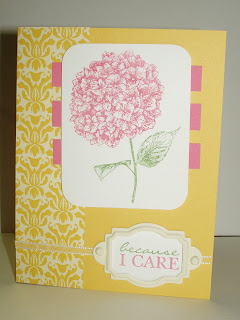
The card I made uses LOTS of new stuff!

  • Greenhouse Gala Designer Series paper- YUM!
  • Because I Care Hostess Level 1 stamp set
  • Daffodil Delight- one of the colours
  • Daffodil Delight ribbon
I just love working with my new stuff. And I still have lots to try out and a whole new box of stuff on route to my place!! So much fun! Another new product I used for this card, but that you can't see is the AWESOME new Colour Coach! This has to be the BEST tool ever! I know I am going to be using it for everything I make. I knew that I wanted to use the Daffodil Delight paper from the Greenhouse Gala DSP pack, but didn't know what other colours to put with it. I had an idea about using pink, but again, what shade. In fact, in my head I had picked Pretty in Pink. As for the green I was probably going to reach for Old Olive, as I almost always do but I thought I would use this niffy new tool.

The Colour Coach has a card for each of the fabulous colours we carry. On the backside it lists colour combos etc. I simple found the Daffodil Delight card, and then held it up against my pink options, it was clear that the pink I needed for this card was Regal Rose. I then found all the greens and settled on Wild Wasabi-one of the previous in-colours now a part of the new colour collections. Every crafter will want to have one of this cool things, and the best part.....it's only $18.95!! So very very worth it!

Products used: All Stampin' Up
Stamp sets: Because I Care Hostess Level 1 set
Card stock: Daffodil Delight, Regal Rose, Whisper White
Designer Series Paper: Greenhouse Gala
Ink: Regal Rose, Wild Wasabi.
Accessories: Corner Rounder punch, Hodgepodge Hardware, Daffodil Delight ribbon, Dimensionals.

The stamp set I used today is a Hostess set, so the only way you can get it is by Hosting a workshop, placing an order of $200 or more, or by collecting a bunch of orders from your friends and family and submitting them to me. I call this a Catalogue Workshop. Contact me today to get started!

I hope to have some crafting time tonight after Xander goes to bed, or Kieran and I might just watch a movie! Either way, I should be back tomorrow with some more new products for you to drool over!

Cheers,

Thursday, July 8, 2010

New Catty stuff and PPA Colour Challenge

Hello Blogland!

It's a hot one up here in Southwestern Ontario! I am pretty much staying inside, because it's way too hot out there!!! It's days like this (hitting 32 degrees Celsius-that's 89.6 F for my American friends) that kill me! And that isn't taking humidity in to effect either. I think it's closer to 45 degrees (115F) with the humidex. So, those of you who have the misconception that Canada is always cold, I can tell you quite honestly that it is not. We have pretty much been running our AC since mid-may and last winter never really did get very cold. Anyhow, enough about the weather, us Canadian's can go on forever on that topic, we really arn't happy no matter what the temp is!

Now on to the crafty stuff!! As I have said before, the new Catty is AWESOME!! I fell in love at first glance! Honestly, cant get enough! One of the best perks of being a SU demo is that we get not only sneak peaks of the new stuff, but we get pre-order opportunities too. One of the items we could pre-order from the new catty is the "Artistic Etchings" stamp set. As soon as I saw it I fell in love!!
For those of you who know me well, know that I am obsessed with all things French, namely the wine and cheese! But I love classic French images. And what is more classic than the Eifel Tower? We had a set last year ("Chic Boutique" pg. 76 2010-2011 IDB&C) but it was too doodle-y for my tastes. This one however is perfect!

So I decided to use today's PPA Colour Challenge of Basic Grey, So Safron & Chocolate Chip as my starting point with this set.

I started with a piece of Basic Grey Card stock for my card base and stamped the "Amour" stamp from this set all over it for a background. I then inked the edges with a Stampin' Sponge with Basic Grey Ink. The Top Note die was cut out of Presto Pattern's Paper (which I am soooooo happy is in the new Catty- 117175 pg. 172). I sponged that using So Safron ink, stamped the Eifel tower in Basic Grey (stamped and stamped off), and the edges were inked with Chocolate Chip. The Ribbon I used is the Satin ribbon in Chocolate Chip- which I must note is NOT in the new catty. This item has been replaced with Early Espresso ribbon instead. However, if you still want some good ol' Chocolate Chip satin ribbon, it is in the current mini catty on page 13. So, good news is that along with Bashful Blue and Basic Grey these ribbons are still available until August 31st. But then they are GONE!! So stock up now! Sorry for the diversion.....back to my card. I then stamped the Eifel Tower in Chocolate Chip on a piece of Whisper White paper and cut it out with my paper snips. Now, here is the best part, not sure if you can see it in the picture, but after that I adhered tiny adhesive rhinestones down the top half of the Eifel tower simulating all the beautiful sparkling lights on the tower at night. And yes, we now have adhesive rhinestones and pearls in the new catty (pg 188). You get 150 of each for only $6.50!!! I have bought tons of these beauties! I then adhered the Eifel tower to my card using dimensionals.

Tip: Dimensionals too big for your element? No problem, simply cut the dimensional using your paper snips to the right size. I often use just have a dimensional depending on what I am sticking down.

Products used: All Stampin' Up
Stamp sets: Artistic Etchings
Card stock: Basic Grey, Whisper White
Designer Series Paper: Presto Patterns Paper
Ink: Basic Grey, So Safron, Chocolate Chip.
Accessories: Top Note Die for the Big Shot, Chocolate Chip Satin ribbon, Stampin' Sponges, Rhinestones.

I will leave you with a few pictures we took at the Eifel Tower when we were in France for our Honeymoon almost 5 years ago. Hard to believe it has been almost 5 years since Ed and I were married. Oh boy, does time fly. Hope you enjoyed today's new product preview. Stay tuned, there will be more!!


Cheers,

Tuesday, June 8, 2010

I was chosen!

It's true, I was! When I went to check out Kristina Werner's round-up of the last Colour Inspiration, I was dumbfounded! My card last week was chosen as one of her top 10! I was jumping for joy when I read the news, I have been following her blog for sometime now and I love her fun and hip sense of style. Not to mention that the competition was stiff!! So to have been selected is a HUGE honour!

An that brings us to today's card which is my submission for this weeks Colour Inspiration Challenge at Kristina's blog. I really really appologize for the poor picture quality but I can not find my camera charger, and so, yet again I have had to use my iPhone for the picture.

I have been somewhat obsessed with colouring our Presto Patterns paper ever since Saturday at Palooza (thank you Julie LeBlanc!). I thought it would work wonderfully for today's challenge.

The colours for this challenge are Chocolate Chip, Elegant Eggplant, Old Olive, Certainly Celery, light plum (I used a combo of Almost Amethyst and Lavender Lace) and cream.

Although it doesn't show well in the picture, the background was sponged first with Certainly Celery and then with Old Olive. I really really like how this card turned out. Thank goodness I ordered more Presto paper, because at this rate I am going to use all of mine up!

Products used: All Stampin' Up
Stamp sets: Elements of Style (Summer Mini)
Card stock: Very Vanilla, Chocolate Chip
Designer Series Paper: Presto Patterns Paper
Ink: Certainly Celery, Old Olive, Elegant Eggplant Markers-Elegant Eggplant, Almost Amethyst, Lavender Lace, Chocolate Chip.
Accessories: Modern Label Punch, Movers and Shapers Die for the Big Shot with the Modern Label die, Chocolate Chip Satin ribbon, Stampin' Sponges.


Cheers,

Monday, June 7, 2010

Happy Monday & this weeks PPA!

I had a super busy Stampin' weekend! This weekend was the 3rd Stampinpalooza hosted by my upline Caroline LeBel. And what a fantastic weekend it was! The Guest speaker was none other than my American Mentor Ronda Wade. I could listen to that woman speak for hours!! Thankfully because I train with her I get to have a one-on-one call with her this evening! If you are interested in training with Ronda, contact me for more info.

Here is a picture of Donna Lee, Ronda Wade, Myself and Susy Godinho on Saturday. See you can tell we are having a great time!

They took pictures of me presenting (I demo'd how to make rag quilt purses, with sewing and all) but I look terrible in all of them! I obviously talk with my hands a lot! Or I sit around doing jazz hands all day long or something! I thought I would share one with you, but that's all you are going to get!

If you have never been to a Stampinpalooza before you need to free yourself up for the first weekend in October. Caroline always puts on an amazing event with fabulous presenters, demonstrations, AWESOME make n' takes (I will show those to you later this week) and so much more including an ice cream sundae bar!! Weee Hooo! I learned a lot of awesome things this weekend, which I hope to share in the weeks to come. The card today was created with one of those fabulous techniques. Julie LeBlanc shared with us an amazing way to work with the new Presto Pattern paper from the current mini (which I am very happy to announce will be in the new catty too!). Julie is super talented and this technique is a testament to that!

Julie showed us how to get multicoloured effects on our Presto paper using sponges, ink and markers! Isn't the result stunning??? This card was inspired by the PPA challenge this week.

I am going to play with this technique some more to produce some really beautiful cards. Stay tuned!

Products used: All Stampin' Up
Stamp sets: Elements of Style (Summer Mini)
Card stock: Whisper White, Basic Black
Designer Series Paper: Presto Patterns Paper
Ink: Basic Black, Certainly Celery, Markers-Cameo Coral, Pumpkin Pie, Only Orange, Always Artichoke
Accessories: Designer Label Punch, 1" circle punch, Pumpkin Pie 1/4" grosgrain ribbon, Stampin' Sponges.


Cheers,

Thursday, May 27, 2010

One card, Two Challenges!

Hi Everyone,

Crazy HOT weather we are having here. Being that I am more of a cold weather girl, I am not over the moon like some. But I am glad that summer is finally here, and they are saying that it is going to be hot and dry! At least we should see less rain than last year. Too bad we don't have a pool at our new place!

Just a reminder to visit this post to see my new Workshop Walk-through for Stampin' Up! Demo's and leave me a comment with a new name to be entered in a contest to win a copy! And members of my team, you guys get a copy for FREE! Just one of the many perks to being on the "B Canadian" Stampers team.

Oh and this Sunday is my NEW Studio Grand Opening bash! RSVP if you can make it.

Okay, on to today's card. This one was created based on two challenges this week. Kristina Werner's colour inspiration challenge and Pals Paper Arts Sketch challenge. The colours were really challenging. There was a Bright bluish purple, and I decided to use Rich Razzleberry, Bashful Blue, a bright yellow (Crushed Curry), A medium blue (Ballet Blue), Certainly Celery and White. Plus I had to use a bit of black for the flowers outline. I coloured the flowers using a combo of markers and blender pens and ink from the top of my ink pad. I am not sure that I love this card. I think there are too many colours for my liking. Ah well, if you don't try you will never know!

Products used: All Stampin' Up
Stamp sets: Elements of Style (Summer Mini)
Card stock: Whisper White, Ballet Blue, Bashful Blue, Crushed Curry
Ink: Basic Black, Rich Razzleberry, Certainly Celery
Accessories: Sale-a-bration Scallop trim Punch (which will be in the 2010-2011 Idea Book & Catalogue), Blender Pen.


Cheers,

Thursday, August 20, 2009

Another PPA Challenge and a sneak-peak of my Big Shot class


Hi Guys,

It's Thursday time for another Pal Paper Arts Challenge. This week is "Anything but a card" and it just so happened that I created a matchbox for Halloween for my Big Shot class on Friday.

This adorable little box uses the Matchbox die for the Sizziz Big Shot and the new Cast-a-spell Designer Paper from the current catalogue. I have also adorned it with some Pumpkin Pie striped grosgrain ribbon attached with a black brad from the vintage brads. The sentiment is stamped on a tag from the Matchbox die and is from the "Holiday Best" hostess set. I coloured it with my Old Olive, Basic Black and Pumpkin Pie Stampin' Write Markers. Too cute!

This next card showcases the Butterflies Die and the top note. Yes, that is the top note die, but it is run through the Big Shot twice! How cool is that? I have used the Razzleberry Lemonade Patterned paper for this card and the colours Rich Razzleberry, Melon Mambo & Crushed Curry. The sentiment is from my FAV sentiment set "Teeny Tiny Wishes" and I just adore that Modern Label punch!

The last card I am going to share with you today also uses the Top note die and this time is is punched twice. Once using Bashful Blue and the second time using some Night of Navy DSP from the Hostess Pattern Paper pack. The adorable little birds is from the Sizzlets set "Birds & Blooms" and the "Peace" sentiment is from the Decorative Strip Die. Lots of dies on this one. And what a pretty Christmas/Seasonal card.

I will share the last card with you on Saturday as it is also my swap card for the RazzleDazzle event that I am attending in London that day. So I want to wait to post the card.

There is still space remaining for my Xmas Card & Big Shot class this Friday, cost for each is $20 or $35 if you wish to take both. I will be posting the remaining Xmas cards for you tomorrow along with the WINNER from my "100 Posts contest".....finally.....sorry for the wait guys, I have been sooooooo busy getting ready for the two classes and the Saturday event.

Cheers,

Wednesday, August 19, 2009

PPA Artist Pick of the Week!!!

Wow!! I was selected as one of the Artist picks of the week for the Pals Paper Arts Challenge. My "Look who's Turning" card that I posted a few days ago was chosen! I feel so honoured and quite shocked. You should see all the amazing and beautiful submissions!! Go check it out, and why not try playing along??

In the meantime, here is another card that we will be making on Friday for the Xmas in August class.
This is actually one of the first cards I ever made at my Upline Caroline's studio back in 2008. When I was selling cards last Christmas this was one of my most popular designs. I love the non-traditional colours of Bravo Burgundy & More Mustard together. Plus I love how you can take a non-Xmas set like "Lovely as a Tree" and make a beautiful holiday card.

Speaking of selling Xmas cards, I will be doing it again this year. Cost is $10 for 4 cards. I am also able to large orders for businesses etc. Cost for a box of 20 cards is $60.

Cheers,

Monday, August 17, 2009

Pal Paper Arts challenge

It's that time again! I have really enjoyed doing the PPA challenges because each week it is a different kind of challenge. First a colour one, then a sketch and now an inspiration challenge. This is the picture to use for inspiration. Naturally for me this picture made me think of kids, and I loved the little touches of animals around the room. Plus I decided to use some of the main colours pictured here, Red, Blue & Green.

I decided to use my "Look who's turning" set again because it has both animals and a very kid like feel.
It's really hard to tell from the picture, but the numbers have been clear embossed on the Ballet Blue base. The numbers are on one stamp, so you would use your markers to colour just one for a kids birthday card or you can use the entire strip for backgrounds or stamp all of them and circle the age....etc. Also, and this is hard to see the animals all have a coating of Crystal Effects to gloss them up to match the embossed numbers. This card definately got the kid stamp of approval as my son Xander who is 20 months old waved good-bye to it before going to the splash pad today. He has never waved to one of my cards before! :)

Come back tomorrow to see a sneek peak of one of the cards we are doing at Friday's Christmas in August class. And I will announce the winner of my "100 Blog post contest"! :)

Products used:
Stampin' Up "Look who's Turning" stamp set
Stampin' Up Card stock- Ballet Blue, Real Red, Green Galore, Whisper White.
Stampin' Up Ink- Ballet Blue, Real Red, Green Galore.
Accessories: Dimensionals, Bashful Blue 1/4" grosgrain ribbon, Crystal Effects, Word Window Punch, Modern Label punch, Clear Embossing powder, Heat Tool, paper snips.

Cheers,

Thursday, June 11, 2009

Kristina's Colour Challenge #54


I love working on these challenges!! I decided to use one of my new sets!!! That's right, those adorable little birdies are from one of the new Level 3 Hostess sets!! I am not going to share the whole set with you, but the rest of the set is just as freakin' cute!!! I also decided to use my Sticky cuts and my new glitter!! Oh and the red micro beads too! FUN!

Products used:
Stampin' Up "More the Merrier" 2009/2010 Hostess Level 3 stamp set
Stampin' Up Card stock- Bashful Blue, Green Galore, Pumpkin Pie, Whisper White.
Stampin' Up Ink- Basic Black & Stampin' Write Markers (Taken with Teal, Bashful Blue, Real Red, Pumpkin Pie.
Accessories: Water colour pencil crayon, blender pen, Sticky Cuts, Fine Cosmo Glitter, Red Bead Duo, Vintage Brads.

Cheers,

Sunday, May 24, 2009

Kwerner Colours #53

It's that time again, and I regret that I didn't get a chance to participate in #51 or 52, but sometimes there just isn't the time to play :(


Once again, these are not colours that I would EVER put together on my own, but I LOVE how my card turned out. It's sooooo bold!! My team members can look forward to a version of this card at our team meeting!

The flowers from Eastern blooms were first stamped on my paper using versamark and then I embossed them with clear embossing powder. I love how professional clear embossed images look.

Products used:
Stampin' Up "Eastern Blooms" stamp set, "Elegant Thank You" stamp
Stampin' Up Card stock- Basic Black, Pacific Point, Summer Sun, Riding Hood Red, Whisper White
Stampin' Up Ink- Versamark, Pacific Point, Riding Hood Red, Summer Sun, Basic Black
Accessories- Clear embossing powder, Heat Gun, 1 1/4" square punch, paper snips, 2-way Glue pen

Cheers,
 

Free Blog Counter